Linear Regression
Linear Regression
What is a variable?
A variable is some kind of characteristic that we might be observing (by measuring or counting or asking someone, etc) when we are conducting a statistical investigation.
For example, we might be studying the weights of some athletes. The weight of an athlete is a characteristic of that person. The weight is not the same for all athletes, because each athlete has their own weight. So the weight varies between athletes. Hence it is a variable.
Variables can be either qualitative or quantitative.
(Qualitative variables are also sometimes referred to as attribute variables or category variables.)
Quantitative variables can be either discrete or continuous.
Continuous variables need to be rounded off for the purpose of recording, calculation and for plotting on a graph. If we round off values of a variable to the nearest whole number, (for example, the weights of athletes might be recorded to the nearest kilogram), that does not mean that the variable has become a discrete variable.
Comparing two variables
In many statistical investigations, there might be only one variable. In the above example, we might be studying the weights of a group of athletes. So, the weight of the athletes is the only variable.
In other investigations, we might want to record values of two variables (or even more than two) and then we might want to compare the two variables and make some conclusions. For example, we could record the weights and the heights of the same group of athletes. It would be reasonable to suppose that there should be some connection between the two variables. If someone is taller, they will usually also be heavier. We know that this will not be an exact relationship, because we know that there are also some tall light people and some short heavy people, even if they are athletic, depending on their event speciality.
Most people would agree that we can generally not control our height, but our weight depends (to a large extent) on what our height has become. For this reason, we would refer to the height as the independent variable and the weight as the dependent variable.
When we draw a graph to compare the two variables, it is usual to put the independent variable on the horizontal axis and the dependent variable on the vertical axis. Such a graph is called a scatter graph or scatter diagram (or scattergram).
EXAMPLE:
The following table gives the height and weight of each of twenty athletes:


Construct a scatter diagram to illustrate the relationship between the two variables.
A Scatter Diagram to show Weights and Heights of Twenty Athletes


What is a variable?
A variable is some kind of characteristic that we might be observing (by measuring or counting or asking someone, etc) when we are conducting a statistical investigation.
For example, we might be studying the weights of some athletes. The weight of an athlete is a characteristic of that person. The weight is not the same for all athletes, because each athlete has their own weight. So the weight varies between athletes. Hence it is a variable.
Variables can be either qualitative or quantitative.
(Qualitative variables are also sometimes referred to as attribute variables or category variables.)
Quantitative variables can be either discrete or continuous.
Continuous variables need to be rounded off for the purpose of recording, calculation and for plotting on a graph. If we round off values of a variable to the nearest whole number, (for example, the weights of athletes might be recorded to the nearest kilogram), that does not mean that the variable has become a discrete variable.
Comparing two variables
In many statistical investigations, there might be only one variable. In the above example, we might be studying the weights of a group of athletes. So, the weight of the athletes is the only variable.
In other investigations, we might want to record values of two variables (or even more than two) and then we might want to compare the two variables and make some conclusions. For example, we could record the weights and the heights of the same group of athletes. It would be reasonable to suppose that there should be some connection between the two variables. If someone is taller, they will usually also be heavier. We know that this will not be an exact relationship, because we know that there are also some tall light people and some short heavy people, even if they are athletic, depending on their event speciality.
Most people would agree that we can generally not control our height, but our weight depends (to a large extent) on what our height has become. For this reason, we would refer to the height as the independent variable and the weight as the dependent variable.
When we draw a graph to compare the two variables, it is usual to put the independent variable on the horizontal axis and the dependent variable on the vertical axis. Such a graph is called a scatter graph or scatter diagram (or scattergram).
EXAMPLE:
The following table gives the height and weight of each of twenty athletes:
A Scatter Diagram to show Weights and Heights of Twenty Athletes
After plotting the scatter diagram we should interpret it.
In this case we can see that the points seem to be partly spread out, but generally they appear to follow a straight line. This shows that as the height increases, the weight also generally increases, but it is not an exact relationship. We conclude that the two variables show a weak positive correlation. The following diagrams illustrate the different types of correlation between two variables:
Strong positive correlation:
The points lie very closely to a straight line which has positive gradient.
There is a very close relationship between variables A and B.
When the value of A is large, the value of B is also large. When the value of A is small, the value of B is also small.
As the value of variable A increases, the value of B also increases.
Weak positive correlation:
The points are scattered about a straight line which has positive gradient.
There is an approximate relationship between variables C and D.
When the value of C is large, the value of D also generally tends to be large. When the value of C is small, the value of D also generally tends to be small.
As the value of variable C increases, the value of D also generally tends to increase.
Strong negative correlation:
The points lie very closely to a straight line which has negative gradient.
There is a very close relationship between variables P and Q.
When the value of P is large, the value of Q is small. When the value of P is small, the value of Q is large.
As the value of variable P increases, the value of Q decreases.
Weak negative correlation:
The points are scattered about a line which has negative gradient.
There is an approximate relationship between variables R and S.
When the value of R is large, the value of S generally tends to be small. When the value of R is small, the value of S generally tends to be large.
As the value of variable R increases, the value of variable S generally tends to decrease.
No correlation:
The points are widely scattered without any clear line being followed.
There is no relationship between variables M and N.
The value of one variable doesn't tell us anything about the value of the other variable.
Linear Regression involves trying to find out whether a set of data for two variables can be said to be related in such a way that a straight line can be used to show the relationship. If so, then the straight line can be used to make a prediction of the value of one variable given a particular value of the other variable. In the example at the beginning of this section, can we predict the weight of another athlete if we are told the height?
The next stage of the processing of the data for the two related variables is to try to draw the line of best fit on the graph. The simplest method is to draw the line of best fit by eye. This means that we just try to put a straight line through the middle of the plotted points so that it appears to be going in the same direction. We make our judgement about what is the line of best fit by simply looking at it. The advantage of this method is that it is quick and easy, but the disadvantage is that it is subjective, in other words, different people might decide to put slightly different lines, depending on their perception. Another method is the method of semi-averages, and if we use it we should all get the same straight line. (The method of semi-averages is also sometimes known as the three-point method.)
EXAMPLE:
Let's use the same example of the twenty athletes, with the independent variable height along the x-axis and the dependent variable along the y-axis.
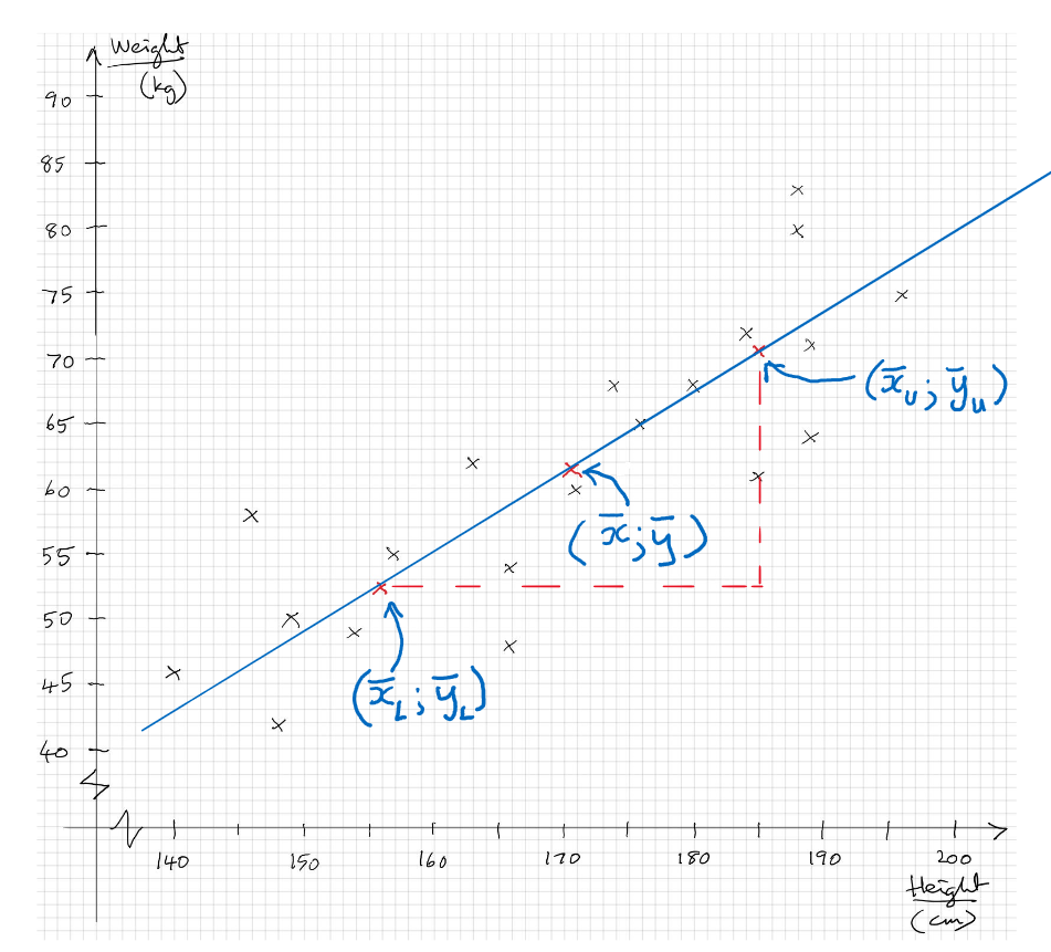
First we find the mean point by calculating the mean of the heights and the mean of the weights and using these two values as the coordinates of the mean point. Any line of best fit must pass through this point.
Next we find the mean of the smallest ten x-values (i.e. the left-hand-side half) and the mean of the ten y-values which correspond with them. (Note that this might not necessarily be the smallest ten y-values.) We plot these as the coordinates of the Lower Semi-Average.
Finally we find the mean of the ten largest x-values and the mean of the ten corresponding y-values and plot these as the coordinates of the Upper Semi-Average.
We can then draw a straight line which will pass exactly through these three points and this is the line of best fit.
Note that if there had been an odd number of athletes, we would first calculate the mean point using all the data, then drop the one with median height so that we have equal numbers to calculate the semi-averages. This might cause the mean point and two semi-averages to be not in a perfect straight line. If that happens, we should make the line of best fit go exactly through the mean point and as near as possible to the semi-average points.
Scatter Diagram to show heights and weights of twenty athletes and line of best fit:
Now we can use the line of best fit to make predictions, but bear in mind that the predictions will not be very reliable because the correlation is weak.
If we are told that there is another athlete whose height is 160cm, we can read off a predicted value of their weight from the graph.
Alternatively, we can find the equation of the line of best fit and then use it to predict the weight if we are given any athlete's height.
[In more advanced studies, you will learn that we can calculate a correlation coefficient to state how closely the points fit to a straight line. Its value will be from -1 (for perfect negative correlation in which the points all lie exactly on a straight line with negative gradient) to 0 (absolutely no correlation at all) to +1 (perfect positive correlation in which all the points fit exactly on a straight line with positive gradient). But note that the correlation coefficient is not necessarily the same as the gradient; for example, two variables might have a correlation of +1 with the graph having a gradient of +2. The correlation coefficient for the above example of some athletes turns out to be +0,92. You do not need to know how to calculate correlation coefficients for our syllabus.]
Correlation does not necessarily mean Causation: Finally, statisticians need to be aware that a strong correlation between two variables does not necessarily mean that one of the two variables can influence the other. For example, if we compare the two variables "amount of Coca Cola sold during a day" and "number of people wearing warm overcoats on the same day" we will find that there is a strong negative correlation, because on a day when a large number of people are wearing warm overcoats we will expect to see fewer people drinking Coca Cola. But that doesn't mean that we can improve the sales of Coca Cola by banning the wearing of warm overcoats. Also, you can't make people drink less Coca Cola by forcing them to wear warm overcoats. The two variables are correlated, but changing the value of one does not cause the other to change. In this case, both of the two variables are also correlated to a third variable, which is "outdoor temperature on a day". In this case, it is the temperature that causes people to drink more or less Coca Cola and to wear fewer or more warm overcoats.